本站消息

CSS子元素相对父元素水平垂直居中
发布于2021-01-31 14:10 阅读(1256) 评论(0) 点赞(16) 收藏(2)
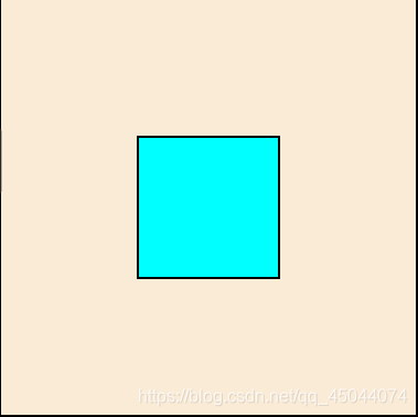
1. 水平居中(margin: auto;)子父元素宽度固定,子元素上设置 margin: auto; 子元素不能设置浮动,否则居中失效。
- #div1{
- width: 300px;
- height: 300px;
- background-color: antiquewhite;
- }
- #div1 p {
- width: 100px;
- height: 100px;
- background-color: aqua;
-
- /*float: left; !*如果设置了浮动,则自动居中就会失效。*!*/
- margin: 0 auto;
- }
-
- <div id="div1">
- <p></p>
- </div>

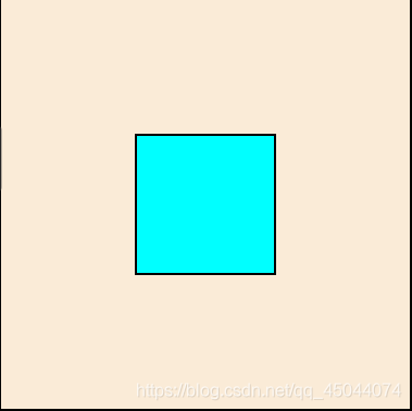
2. 水平居中,子父元素宽度固定,父元素设置 text-align: center;
子元素设置 display: inline-block; 子元素不能设置浮动,否则居中失效。
如果将元素设置为 inline , 则元素的宽高设置会失效,这就需要内容来撑起盒子
- #div2 {
- width: 300px;
- height: 300px;
- background-color: antiquewhite;
-
- /*position: relative;*/
- text-align: center;
- }
- #div2 p{
- width: 100px;
- height: 100px;
- background-color: aqua;
- margin: 0;
-
- /*float: left; !*如果设置了浮动,则自动居中就会失效。*!*/
- display: inline-block;
- /*display: inline;*/
- /*display: inline-flex;*/
- }
-
- <div id="div2">
- <h4>其他内容</h4>
- <p></p>
- <h3>其他内容</h3>
- </div>

1. 水平垂直居中,子元素相对于父元素绝对定位,
子元素top,left设置为50%,子元素margin的top,left减去自身高,宽的一半。
- #div3 {
- width: 300px;
- height: 300px;
- background-color: antiquewhite;
-
- position: relative;
- }
- #div3 p {
- width: 100px;
- height: 100px;
- background-color: aqua;
-
- /*margin-top: 10%; !*百分比相对于父元素*!*/
- /*padding-top: 10%; !*百分比相对于父元素*!*/
- position: absolute;
- top: 50%;
- left: 50%;
- margin-top: -50px;
- margin-left: -50px;
- }
-
- <div id="div3">
- <p></p>
- <h3>其他内容</h3>
- </div>
2. 水平垂直居中,子元素相对于父元素绝对定位,
将子元素的top,right,bottom,left均设为0,然后设置子元素 margin: auto;
- #div4{
- width: 300px;
- height: 300px;
- background-color: antiquewhite;
-
- position: relative;
- }
- #div4 p{
- width: 100px;
- height: 100px;
- background-color: aqua;
-
- position: absolute;
- top: 0;
- left: 0;
- bottom: 0;
- right: 0;
- margin: auto;
- }
-
- <div id="div4">
- <p></p>
- <h3>其他内容</h3>
- </div>

3. 水平垂直居中,父元素设置 display: table-cell; vertical-align: middle;
子元素设置 margin: auto;
这种方式是让所有的子元素作为一个整体垂直居中,并不能单独指定某一个子元素居中
- #div5{
- width: 300px;
- height: 300px;
- background-color: antiquewhite;
-
- display: table-cell;
- vertical-align: middle;
- }
- #div5 p{
- width: 100px;
- height: 100px;
- background-color: aqua;
- margin: auto;
- }
-
- <div id="div5">
- <p></p>
- </div>

4. 水平垂直居中,子元素相对定位,top,let设为50%,transform: translate(-50%, -50%);
这种方式并不会释放子元素在文档中所占的位置。
- #div6{
- width: 300px;
- height: 300px;
- background-color: antiquewhite;
- }
- #div6 p {
- width: 100px;
- height: 100px;
- background-color: aqua;
- margin: 0;
- position: relative;
- top: 50%;
- left: 50%;
- transform: translate(-50%, -50%);
- }
-
- <div id="div6">
- <p></p>
- <h3>其他内容</h3>
- </div>

5. 水平垂直居中,子元素相对于父元素绝对定位,
子元素top,let设为50%,transform: translate(-50%, -50%);
这种方式会释放子元素在文档中所占的位置
- #div7{
- width: 300px;
- height: 300px;
- background-color: antiquewhite;
- position: relative;
- }
- #div7 p {
- width: 100px;
- height: 100px;
- background-color: aqua;
- margin: 0;
- position: absolute;
- top: 50%;
- left: 50%;
- transform: translate(-50%, -50%);
- }
-
- <div id="div7">
- <p></p>
- <h3>其他内容</h3>
- </div>

6. 水平垂直居中,父元素设置 display: flex; justify-content: center; align-items: center;
justify-content: center; 是让所有的子元素作为一个整体居中。
- #div8{
- width: 300px;
- height: 300px;
- background-color: antiquewhite;
-
- display: flex;
- justify-content: center;
- align-items: center;
- }
- #div8 p{
- width: 100px;
- height: 100px;
- background-color: aqua;
- margin: 0;
- }
-
- <div id="div8">
- <p></p>
- </div>
所属网站分类: 技术文章 > 博客
作者:我喜欢css
链接:http://www.qianduanheidong.com/blog/article/78/ee5592e2c530bc551ff0/
来源:前端黑洞网
任何形式的转载都请注明出处,如有侵权 一经发现 必将追究其法律责任
16
0
收藏该文
昵称:
评论内容:(最多支持255个字符)
---无人问津也好,技不如人也罢,你都要试着安静下来,去做自己该做的事,而不是让内心的烦躁、焦虑,坏掉你本来就不多的热情和定力
程序员的那些事(new)
电子书(new)
博客(new)
视频教程(new)
问答(new)
游戏(new)