

vue3利用渲染函数实现格子布局(九宫格)
发布于2022-01-06 23:15 阅读(2388) 评论(0) 点赞(27) 收藏(1)
前言
因为工作中需要用到类似九宫格的布局,而element-plus里没有类似的组件,因此自己实现了一个格子布局的组件
思路
其实格子布局目前我更多的是在手机端使用,而目前手机端开发使用的是vant组件库,这个组件库本身就有九宫格布局组件,它大致是由一个父组件grid,若干子组件grid-item组成来实现,然后我的实现方式也是如此,一个父组件+若干子组件,利用渲染函数主要是可以过滤掉其他非子组件的内容,约束使用方式
实现
宫格布局核心在于限制每行的格子数量,实现方式有很多种,我这里使用的是无序列表,约束ul和li组件的宽度,然后ul添加overflow: hidden,li添加float: left来实现格子布局效果
目前支持的功能:
- 设定列数(最小1)
- 设定格子间距(这里的间距是同时控制格子四个方向的间距,如果需要的话其实可以分的更仔细,比如统一的内边距,纵向间隔,横向间隔等)
- 约束子组件高度等于宽度,也就是正方形格子
具体代码如下
父组件
因为我使用的是vue3,因此这里的实现也是用setup+render实现
<!-- 格子布局组件 -->
<script lang="ts">
import { defineComponent, h, provide } from "vue";

export default defineComponent({
  props: {
    /** 间隔 */
    gutter: { type: Number, default: 10 },
    /** 列数 */
    column: { type: Number, default: 3 },
    /** 约束宽=高 */
    isScale: { type: Boolean, default: false },
  },
  setup(props, { slots }) {
    provide("isScale", props.isScale);
    // 插槽列表
    const slotList: any[] = (slots as any).default();
    // 渲染列表
    const renderList: any[] = [];
    const columnNum = props.column || 1;
    // 尾行编号
    const lastRow = Math.ceil(slotList.length / columnNum) - 1;
    slotList.forEach((el, index) => {
      if (typeof el.type === "object" && el.type.name === "grid-layout-item") {
        if (!el.props) el.props = {};
        if (!el.props.style) el.props.style = {};
        el.props.style.width = `calc((100% - ${props.gutter * (columnNum - 1)}px) / ${columnNum})`;

        // 右边距设置和下边距设置
        el.props.style.marginRight = `${props.gutter}px`;
        el.props.style.marginBottom = `${props.gutter}px`;

        // 每行最后一个不加右边距
        if ((index + 1) % columnNum === 0) el.props.style.marginRight = "0px";
        // 最后一行不加下边距
        if ((index + 1) >= lastRow * columnNum) el.props.style.marginBottom = "0px";

        renderList.push(el);
      }
    });
    return { renderList };
  },
  render() {
    const component = h(
      "div",
      { class: "grid-layout" },
      h(
        "ul",
        { style: { overflow: "hidden", padding: `${this.gutter}px`, margin: "0px" } },
        this.renderList.map((element) => h(element)),
      ),
    );
    return component;
  },
});
</script>

<style lang="scss">
.grid-layout {
  list-style: none;
}
</style>
子组件
子组件使用的是模板,同时使用vue3新特性css的v-bind控制高度等于宽度
<!-- 格子布局组件项 -->
<template>
  <li class="grid-layout-item" ref="liDom">
    <slot></slot>
  </li>
</template>

<script lang="ts">
/* eslint-disable */
export default {
  name: "grid-layout-item"
};
</script>

<script lang="ts" setup>
import { defineProps, inject, ref, watch } from "vue";

defineProps({
  title: { type: String, default: "" },
});

const isScale = inject("isScale") as boolean;

// 自适应高度等于宽度
const liDom = ref();
const height = ref("");
watch(() => liDom.value, (dom) => {
  if (isScale) {
    height.value = dom.clientWidth + "px";
  } else {
    height.value = "";
  }
}, {
  deep: true,
});
</script>

<style>
.grid-layout-item {
  float: left;
  list-style: none;
  height: v-bind(height);
  line-height: v-bind(height);
  text-align: center;
  vertical-align: middle;
}
</style>
效果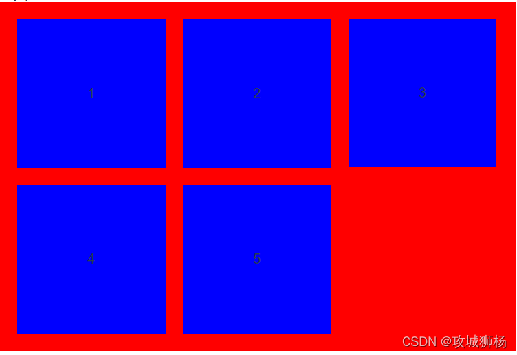
问题
因为子组件宽度是计算的,有时候会因为小数点的关系,导致计算后一行的总宽度大于了100%,目前想到的解决方案就是gutter不为0的时候,在计算宽度的时候让gutter等于gutter+1,目前使用的时候还没有发现问题再次出现,后续需要继续观察,也欢迎大家来使用该组件并提出问题。
原文链接:https://blog.csdn.net/u014050961/article/details/122323191
所属网站分类: 技术文章 > 博客
作者:大哥你来啦
链接:http://www.qianduanheidong.com/blog/article/284406/5c6abbd882d1f2259798/
来源:前端黑洞网
任何形式的转载都请注明出处,如有侵权 一经发现 必将追究其法律责任
昵称:
评论内容:(最多支持255个字符)
---无人问津也好,技不如人也罢,你都要试着安静下来,去做自己该做的事,而不是让内心的烦躁、焦虑,坏掉你本来就不多的热情和定力