

小彩灯特效 html+css
发布于2021-03-07 21:20 阅读(1611) 评论(0) 点赞(29) 收藏(5)
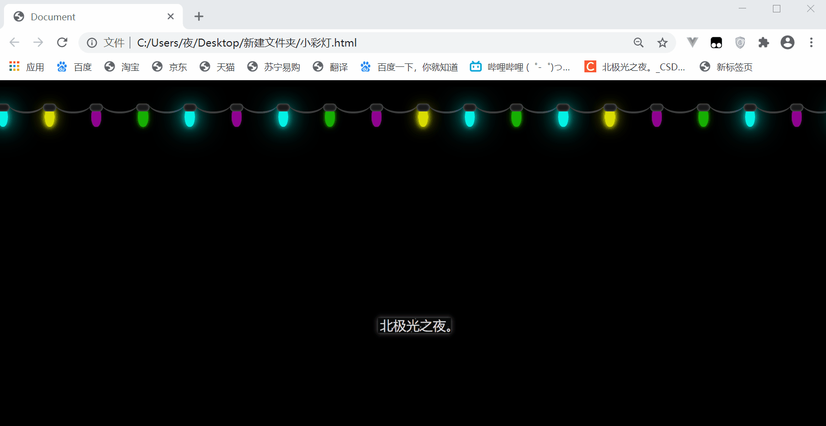
效果:
实现:
1. 添加标签,可以看出一个 li 就是一个灯泡,可以多点,保证设置大小后整体能大过浏览器默认可视区宽度。
 <ul class="container">
        <li></li>
        <li></li>
        <li></li>
        <li></li>
        <li></li>
        <li></li>
        <li></li>
        <li></li>
        <li></li>
        <li></li>
        <li></li>
        <li></li>
        <li></li>
        <li></li>
        <li></li>
        <li></li>
        <li></li>
        <li></li>
        <li></li>
        <li></li>
        <li></li>
        <li></li>
        <li></li>
        <li></li>
        <li></li>
    </ul>
2. 设置底层盒子 .container的基本样式:
.container{
            margin-top: 10px;
            width: 100%;
            height: 120px;
            white-space: nowrap;
            overflow: hidden;
        }
white-space: nowrap; 子元素 li 不换行,会在在同一行上继续排列。
overflow: hidden; 溢出隐藏。
3.设置 li 灯泡的样式:
.container li{
            display: inline-block;
            margin-top: 30px;
            margin-right: 50px;
            width: 15px;
            height: 30px;
            border-radius: 50%;
            position: relative;
        }
display: inline-block; 换为行内块元素。
border-radius: 50%; 角弧度。
4. 用双伪类设置灯帽:
.container li::after{
            content: '';
            position: absolute;
            top: -5px;
            left: 50%;
            transform: translateX(-50%);
            width: 20px;
            height: 12px;
            background-color: rgb(27, 27, 27);
            box-shadow: inset 0 0 3px rgb(129, 129, 129);
            border-radius: 10px;
        }
left: 50%;
transform: translateX(-50%); 水平居中
box-shadow: inset 0 0 3px rgb(129, 129, 129); 内阴影
5. 用双伪类设置电线:
.container li::before{
            content: '';
            position: absolute;
            top: -23px;
            left: 15px;
            width: 55px;
            height: 30px;
            border-bottom: 3px solid  rgb(61, 61, 61);
            border-radius: 50%;
        }
border-bottom: 3px solid rgb(61, 61, 61);
border-radius: 50%; 这样边框可以呈现月牙形状。
6. 设置 4 个动画效果,分别显示不同的颜色闪烁:
 @keyframes lan{
            0%,100%{
                background-color: rgba(4, 255, 242, 0.5);
            }
            50%{
                background-color: rgb(4, 255, 242);
                box-shadow: 0 0 10px rgb(4, 255, 242),
                0 0 30px rgb(4, 255, 242),
                0 0 50px rgb(4, 255, 242);
            }
        }
        @keyframes huang{
            0%,100%{
                background-color: rgba(251, 255, 4,.5);
            }
            50%{
                background-color: rgb(251, 255, 4);
                box-shadow: 0 0 10px rgb(251, 255, 4),
                0 0 12px rgb(251, 255, 4),
                0 0 30px rgb(251, 255, 4);
            }
        }
        @keyframes lv{
            0%,100%{
                background-color: rgba(33, 255, 4,.5);
            }
            50%{
                background-color: rgb(33, 255, 4);
                box-shadow: 0 0 10px rgb(33, 255, 4),
                0 0 12px rgb(33, 255, 4),
                0 0 30px rgb(33, 255, 4);
            }
        }
        @keyframes zhi{
            0%,100%{
                background-color:  rgba(255, 4, 255,.5);
            }
            50%{
                background-color: rgb(255, 4, 255);
                box-shadow: 0 0 10px  rgb(255, 4, 255),
                0 0 25px  rgb(255, 4, 255),
                0 0 40px  rgb(255, 4, 255);
            }
        }
box-shadow: 阴影,添加了它就相当于发光。
7. 给不同位置的 li 添加动画属性:
 .container li:nth-of-type(2n+1){
           animation: lan 2s  infinite;
        }.container li:nth-child(2n+2){
            animation: huang 2.2s infinite;
        }.container li:nth-child(3n+3){
            animation: zhi 1.8s infinite;
        }
       .container li:nth-child(4n+4){
        animation: lv 2.8s infinite;
       }
完整代码:
<!DOCTYPE html>
<html lang="zh-CN">
<head>
    <meta charset="UTF-8">
    <meta name="viewport" content="width=device-width, initial-scale=1.0">
    <title>Document</title>
    <style>
        *{
            margin: 0;
            padding: 0;
            box-sizing: border-box;
        }
        body{
            background-color: rgb(0, 0, 0);
        }
        .container{
            margin-top: 10px;
            width: 100%;
            height: 120px;
            white-space: nowrap;
            overflow: hidden;
        }
        .container li{
            display: inline-block;
            margin-top: 30px;
            margin-right: 50px;
            width: 15px;
            height: 30px;
            border-radius: 50%;
            position: relative;
        }
        .container li::after{
            content: '';
            position: absolute;
            top: -5px;
            left: 50%;
            transform: translateX(-50%);
            width: 20px;
            height: 12px;
            background-color: rgb(27, 27, 27);
            box-shadow: inset 0 0 3px rgb(129, 129, 129);
            border-radius: 10px;

        }
        .container li::before{
            content: '';
            position: absolute;
            top: -23px;
            left: 15px;
            width: 55px;
            height: 30px;
            border-bottom: 3px solid  rgb(61, 61, 61);
            border-radius: 50%;
        }
        .container li:nth-of-type(2n+1){
           animation: lan 2s  infinite;
        }.container li:nth-child(2n+2){
            animation: huang 2.2s infinite;
        }.container li:nth-child(3n+3){
            animation: zhi 1.8s infinite;
        }
       .container li:nth-child(4n+4){
        animation: lv 2.8s infinite;
       }

        @keyframes lan{
            0%,100%{
                background-color: rgba(4, 255, 242, 0.5);
            }
            50%{
                background-color: rgb(4, 255, 242);
                box-shadow: 0 0 10px rgb(4, 255, 242),
                0 0 30px rgb(4, 255, 242),
                0 0 50px rgb(4, 255, 242);
            }
        }
        @keyframes huang{
            0%,100%{
                background-color: rgba(251, 255, 4,.5);
            }
            50%{
                background-color: rgb(251, 255, 4);
                box-shadow: 0 0 10px rgb(251, 255, 4),
                0 0 12px rgb(251, 255, 4),
                0 0 30px rgb(251, 255, 4);
            }
        }
        @keyframes lv{
            0%,100%{
                background-color: rgba(33, 255, 4,.5);
            }
            50%{
                background-color: rgb(33, 255, 4);
                box-shadow: 0 0 10px rgb(33, 255, 4),
                0 0 12px rgb(33, 255, 4),
                0 0 30px rgb(33, 255, 4);
            }
        }
        @keyframes zhi{
            0%,100%{
                background-color:  rgba(255, 4, 255,.5);
            }
            50%{
                background-color: rgb(255, 4, 255);
                box-shadow: 0 0 10px  rgb(255, 4, 255),
                0 0 25px  rgb(255, 4, 255),
                0 0 40px  rgb(255, 4, 255);
            }
        }
    </style>
</head>
<body>
    <ul class="container">
        <li></li>
        <li></li>
        <li></li>
        <li></li>
        <li></li>
        <li></li>
        <li></li>
        <li></li>
        <li></li>
        <li></li>
        <li></li>
        <li></li>
        <li></li>
        <li></li>
        <li></li>
        <li></li>
        <li></li>
        <li></li>
        <li></li>
        <li></li>
        <li></li>
        <li></li>
        <li></li>
        <li></li>
        <li></li>

    </ul>
</body>
</html>
总结:
虽然实现不难,但效果还是挺好看的。
其它文章:
炫彩流光文字 html+css
气泡浮动背景特效 html+css
简约时钟特效 html+css+js
赛博朋克风格按钮 html+css
仿网易云官网轮播图 html+css+js
水波加载动画 html+css
导航栏滚动渐变效果 html+css+js
书本翻页 html+css
3D立体相册 html+css
霓虹灯绘画板效果 html+css+js
记一些css属性总结(一)
Sass总结笔记
…等
所属网站分类: 技术文章 > 博客
作者:听说你混的不错
链接:http://www.qianduanheidong.com/blog/article/33496/6c7affcca6d51fc5987d/
来源:前端黑洞网
任何形式的转载都请注明出处,如有侵权 一经发现 必将追究其法律责任
昵称:
评论内容:(最多支持255个字符)
---无人问津也好,技不如人也罢,你都要试着安静下来,去做自己该做的事,而不是让内心的烦躁、焦虑,坏掉你本来就不多的热情和定力